

Colour Psychology: Paint Choices for Granny Flats
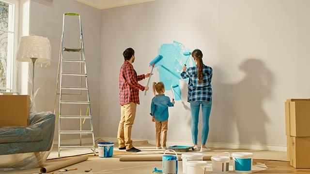
Choosing the right paint colours for a granny flat often feels confusing because every shade influences how the space looks, feels, and functions. Colour psychology explains how colours affect mood and behaviour, and understanding these effects helps you create a comfortable living environment. This guide gives clear, factual advice on selecting colours that improve small-space living, support natural light, and enhance overall usability.
How Colour Psychology Shapes Small Living Spaces
Colour psychology explains how specific colours influence mood, spatial perception, and energy levels. In granny flats, colour choices affect how large the rooms feel, how comfortable they look, and how people interact with the space. Light colours create a sense of openness, while deeper tones add warmth and focus. This foundation helps you make practical decisions that match your lifestyle and the design goals of compact homes. When visiting a granny flat showroom, you often notice how colour instantly changes your first impression of a room, demonstrating how powerful these effects are in real settings.
Best Light Colours for Making a Granny Flat Feel Larger
Light colours make a granny flat appear bigger by reflecting more natural light. Whites, soft greys, and muted creams create a spacious feel because they bounce light evenly across the walls. To make a small room look open, use a shade with an LRV (Light Reflectance Value) above 70. High-LRV colours help reduce shadows, which improves the overall sense of space. In house granny flats often use these tones because they enhance openness even in compact floor plans.
Warm Colours That Create Comfort and Connection
Warm colours add comfort by creating a sense of closeness and calm. Soft terracotta, muted peach, beige, and warm taupe make a small area feel inviting. These tones suit living rooms and dining areas where connection and relaxation matter. Use warm colours sparingly in kitchens and bathrooms because too much warmth can limit brightness. A balanced approach—using warm walls with neutral trims—keeps the space visually grounded while still feeling cosy.
Cool Colours That Improve Calmness and Focus
Cool colours promote calmness and clarity by lowering visual stimulation. Light blues, greens, and aqua tones are ideal for bedrooms and study corners inside a granny flat. These colours mimic elements of nature, which supports concentration and peaceful sleep. A cool palette also pairs well with timber furniture, white cabinetry, and natural décor. To maintain balance, use a cool wall colour with warmer flooring or accessories so the room does not feel cold.
Accent Colours That Add Personality Without Overwhelming the Space
Accent colours add character by creating focal points without overpowering small rooms. Deep navy, forest green, mustard, or charcoal work well on feature walls, cabinetry, or furnishings. Strong colours help define zones inside a granny flat, such as separating a study nook from a living area. The best results come from pairing one bold accent with a soft base colour. This approach keeps the design balanced and ensures the accent enhances the existing palette instead of competing with it.
How Natural Light Affects the Way Colours Look
Natural light changes colour appearance throughout the day, so understanding orientation helps you choose accurately. North-facing rooms get consistent light, making most colours appear true to tone. South-facing rooms receive cooler light, which can make warm tones look more muted. East-facing rooms appear bright in the morning and softer by afternoon. West-facing rooms bring stronger afternoon light, which intensifies warm shades. Always test a sample on the wall and observe it at different times to avoid unexpected results.
Popular Colour Combinations Used in Australian Granny Flats
Common colour combinations in Australian granny flats include neutral tones paired with natural materials. Soft grey with white trims, beige with light timber, and grey-blue with crisp white remain popular because they match both modern and traditional styles. These combinations also complement Australian outdoor landscapes, which improves indoor-outdoor flow. Using nature-inspired palettes helps create a harmonious environment that feels consistent with local surroundings.
Many homeowners exploring paint options for compact spaces rely on specialists who understand layout, colour flow, and small-home design. Master Granny Flats follows this approach by focusing on smart planning, modern finishes, and functional interiors that suit various Australian lifestyles. Their experience helps homeowners choose colours and design features that look cohesive and work well in everyday living.
Table: Example Colour Effects in Granny Flats
| Colour Type | Primary Effect | Example Shades | Best Room Placement |
|---|---|---|---|
| Light Neutrals | Increase spaciousness | White, cream, pale grey | Living room, kitchen |
| Warm Tones | Add comfort | Peach, taupe, terracotta | Lounge, dining area |
| Cool Tones | Promote calmness | Light blue, sage green | Bedroom, study |
| Accent Colours | Add personality | Navy, charcoal, mustard | Feature walls, cabinetry |
Tips for Choosing the Right Paint Finish
Paint finish affects how the colour appears and performs. Matte finishes soften imperfections but absorb light. Satin finishes balance durability and softness, making them suitable for living areas. Semi-gloss finishes reflect more light and resist moisture, which suits kitchens and bathrooms. Choosing the right finish ensures your selected colour stays consistent and durable over time.
Steps for Testing Paint Colours Before Commitment
Testing paint helps you avoid mismatched tones and unexpected shifts in lighting. Start by applying sample patches at least 30 cm wide on different walls. Observe how they change under natural and artificial light throughout the day. Compare samples against furniture, flooring, and décor to ensure harmony. This process gives a realistic preview, helping you make a confident final decision.
Why Colour Psychology Matters for Long-Term Use
Colour decisions influence daily comfort because people respond emotionally to their surroundings. Choosing the right palette supports better sleep, productivity, relaxation, and social interaction. For long-term living, this makes colour psychology a practical part of granny flat design. A thoughtful palette improves usability and keeps the space enjoyable for years.
Conclusion
Colour psychology gives you a clear method for choosing paint colours that improve comfort, usability, and style inside a granny flat. By understanding how each colour group affects mood and space perception, you can make informed choices that work well with Australian lighting and compact layouts. Homeowners who want more help with design planning often explore expert guidance to ensure their choices fit both lifestyle and layout. Explore more topics in our blog section.