

Seasonal Themes Do’s & Don’ts for Coffee Cup Artistry
Coffee cup artistry is more than just a design. It is a creative way to express moods, seasons, and brand stories. Seasonal themes can attract attention and make customers feel connected to the brand. Yet, designing with seasonal ideas also needs planning and care. If done right, it brings excitement and a sense of freshness to customers. This guide explains the do’s and don’ts of using seasonal themes in coffee cup artistry with clear, practical insights.
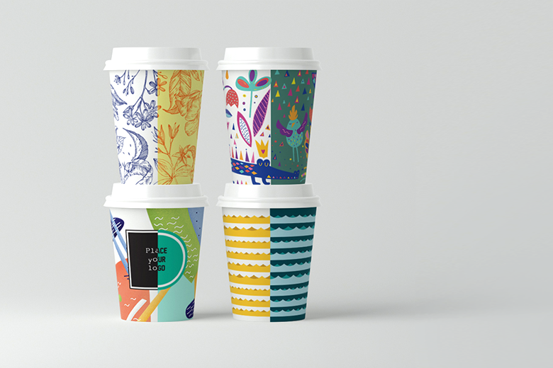
Do Understand the Mood of Each Season
Each season has its own character. Spring is fresh and soft, summer is bright and energetic, autumn is warm and earthy, and winter is cool and calm. When designing a coffee cup for a season, it is vital to first understand the mood. The right mood helps you choose the right colors, shapes, and patterns. For example, spring cups can feature soft greens, pastel pinks, or floral sketches. In summer, you might go for bright yellows, bold blues, or playful patterns. Autumn allows you to explore earthy oranges, warm browns, and leaf motifs. Winter cups can use icy blues, silver snowflakes, or minimalistic white tones.
Designers should also consider cultural meaning. In some regions, summer may mean festivals and beach scenes, while in others, it may symbolize harvest or family gatherings. This understanding helps your design to be more relatable. A coffee shop can also test small batches before full release to see how customers respond to seasonal moods. When the mood of a season is clear, the cups naturally feel fresh and on-brand without feeling forced. This careful approach creates stronger emotional bonds between customers and the brand.
Do Use Sustainable and High-Quality Materials
Seasonal coffee cup designs are often limited editions. Yet, using sustainable materials still matters. Customers today value eco-friendly practices. Cups that are recyclable or compostable show that the brand cares for the planet. Using such materials also boosts the image of seasonal campaigns.
Sustainable options like biodegradable paper, plant-based linings, or reusable cups can carry seasonal art without harming the environment. The design can even highlight this eco-friendly feature with small icons or messages. This creates a positive impression and can lead to more customer loyalty.
High-quality materials also ensure that the design looks sharp. Cheap materials can dull colors, blur details, and even leak. A premium cup with a seasonal theme feels like a collectible. Some customers may keep these cups as souvenirs, extending your brand’s reach. When planning seasonal designs, the material should be chosen alongside the art to ensure the best results. This is also where working with reliable suppliers such as https://ibexpackaging.com/custom-cups/ can help brands create unique seasonal designs that are eco-friendly and durable.
Do Blend Seasonal Colors with Brand Identity
Seasonal colors are exciting, but they can clash with a brand’s identity if used carelessly. A designer should always maintain a link to the brand’s primary colors. This way, even though the cup looks seasonal, it is still recognizable. For example, if a coffee shop’s brand colors are black and gold, the spring cups can include soft golden floral accents with a muted black background. In summer, the same brand can add gold lines over bright patterns.
Balancing seasonal colors with brand colors makes the cup stand out while keeping trust and recognition. It also ensures that customers associate the design with your coffee shop rather than confusing it with another. Over time, seasonal designs become a tradition that customers look forward to. That can increase loyalty and even lead to social media buzz when new seasonal cups arrive.
Designers may also use small repeating elements like logos, icons, or a signature font. This adds a link between the seasonal art and the main brand. In this way, your cup becomes both fresh and familiar at the same time.
Don’t Overload the Design with Too Many Elements
One common mistake in seasonal coffee cup artistry is adding too many themes at once. Some designers try to show every symbol of a season on one cup. This can make the design look crowded and hard to read. Customers enjoy designs they can quickly understand. A clean design also looks more premium and stylish.
When choosing seasonal elements, limit yourself to one or two main ideas. For instance, in autumn, pick either falling leaves or pumpkins, not both with extra patterns and textures. In winter, use snowflakes or a starry sky, not every holiday symbol at once. Negative space (empty space) is also important. It lets the main design breathe and makes the cup more elegant.
Another way to avoid overload is to plan a design theme early. Sketch a few versions and test which one looks balanced. By doing so, you can choose the design that carries a seasonal feel without losing clarity. Customers notice such balance and often feel it reflects a more professional and thoughtful brand.
Do Consider Cultural Sensitivities of Seasons
Seasons can have different meanings in different regions. For example, winter in one country might be linked to snow and Christmas, while in another it might be dry and warm. Cultural symbols like holiday icons, religious motifs, or national plants can be sensitive. Using them without understanding may offend some customers or feel out of place.
A smart designer researches the cultural meaning of a season in their target market before creating the art. This includes checking local festivals, colors, and symbols. For instance, red may be a joyful color in some cultures but a warning sign in others. Floral patterns can symbolize life in spring but may be linked to funerals in some places.
When unsure, stick to neutral yet seasonal ideas. Nature-based elements like leaves, snowflakes, sun rays, or raindrops are usually safe and still communicate the season. If you must include a cultural symbol, make sure it’s widely accepted or explained as part of a campaign. This careful approach avoids risks and shows respect to your audience.
Don’t Ignore Practical Aspects like Heat and Handling
A seasonal design may look beautiful but fail in daily use if practical aspects are ignored. Coffee cups must handle hot liquids, stacking, and transportation. Some inks may fade or smudge when exposed to heat or moisture. Some coatings may peel, making the design look cheap.
When creating seasonal cups, always test how the design performs under real conditions. This includes printing methods, color fastness, and grip comfort. Customers will not enjoy a cup that slips or burns their hand even if the design is stunning. Make sure the sleeve or double-wall feature supports both style and function.
Practical design choices also include font size and placement of text. If the seasonal theme involves special messages, make sure they remain readable even when the cup is full or held at different angles. A strong balance between beauty and practicality ensures the cup delights customers from first sight to last sip.
Do Add Interactive Elements to Engage Customers
Seasonal cups are a great opportunity to engage customers beyond the drink. Interactive elements make the experience memorable. These can be small games, QR codes linking to seasonal playlists, or hidden images revealed as the cup warms.
Such features create buzz and encourage customers to share pictures on social media. For example, a winter cup may reveal a hidden snowflake pattern when hot liquid is poured. A summer cup might include a QR code leading to a cool drink recipe. These playful touches make seasonal designs stand out in a crowded market.
When planning interactive elements, keep them simple and relevant to the season. Make sure they do not interfere with the main art. Also, test them to ensure they work correctly under normal use. This small extra effort can turn a coffee cup from a disposable item into a marketing tool with emotional value.
Don’t Forget the Power of Limited-Edition Messaging
Seasonal designs work best when they feel special and limited. If customers know a cup is available only for a short time, they may buy more or visit more often. This urgency creates excitement. However, many brands forget to highlight the limited-edition nature of their seasonal cups.
Always add subtle messaging to show that the design is seasonal. This can be a small line like “Spring 2025 Edition” or a unique number on the cup. It makes customers feel like they own something rare. Some may even collect these cups year after year.
Be careful not to overuse the limited-edition concept. If every design claims to be special, customers may lose interest. Plan a clear calendar of seasonal releases and communicate it through your shop or social media. This strategy builds anticipation and keeps your brand fresh in customers’ minds.
Conclusion
Seasonal themes in coffee cup artistry can turn a simple beverage into an experience. By understanding seasonal moods, blending colors with brand identity, avoiding overload, respecting cultural meanings, using sustainable materials, ensuring practicality, adding interactive touches, highlighting limited editions, and learning from each campaign, designers can create cups that delight and inspire. Following these do’s and don’ts builds a strong, memorable connection between your coffee brand and its customers all year round.